Navigation
Think navigation’s not important for driving user experience? Survata asked customers to name the most common reason they start product searches on Amazon. In first place:
28 percent of consumers credited Amazon’s experience and easy-to-use navigation.
Selection was second. Price was third.
Get your navigation right.
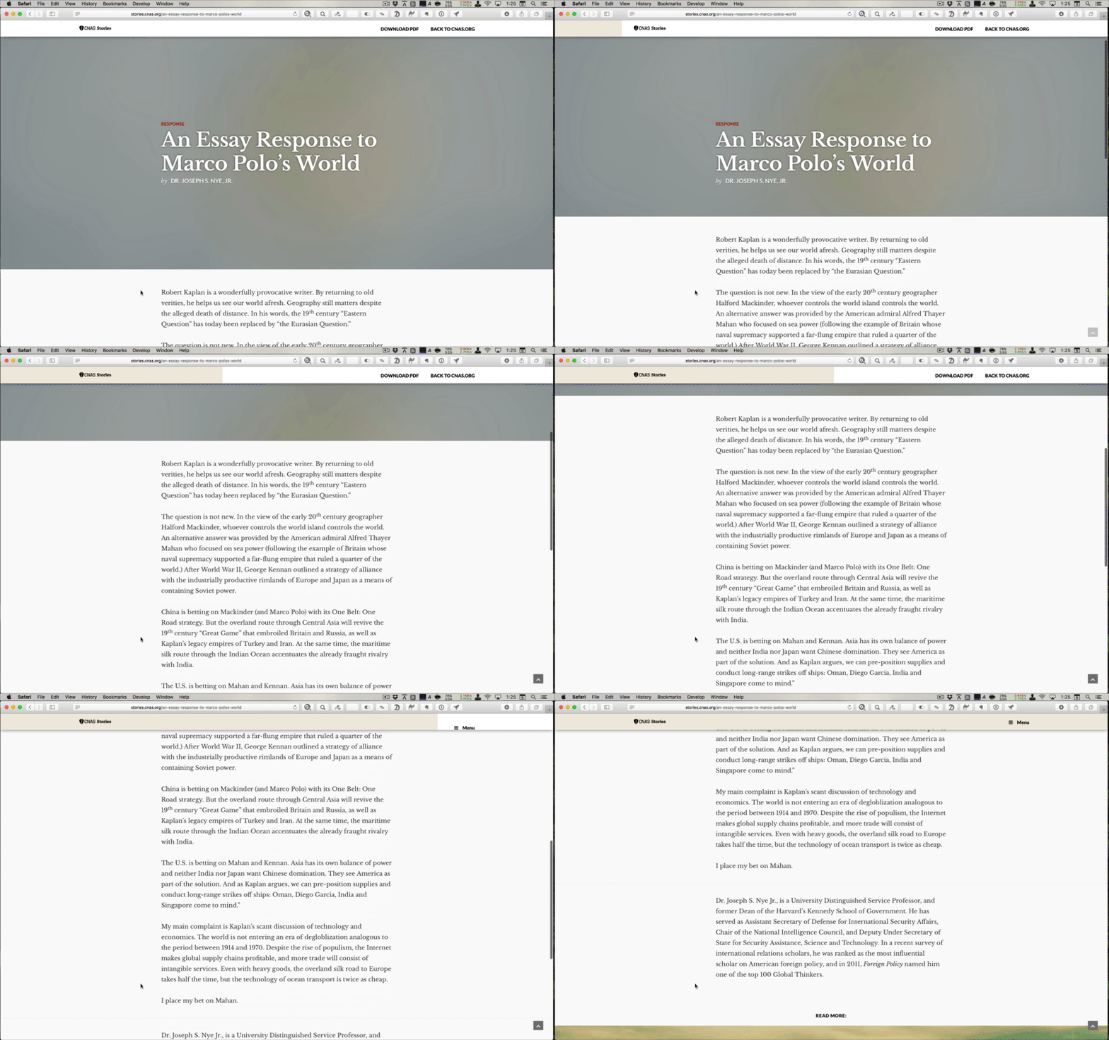
Clever header
This is really clever: a global navigation header that doubles as a progress indicator for the current article. Neat!
Check it out live at CNAS.org.

Miller's Law isn't for IAs
Here’s an article that busts the myth that Miller’s 7 +/-2 concept has any bearing on navigation design. Read it, learn it, love it.
Breadcrumbs
Yes, you need breadcrumbs on your ecommerce site. You need location breadcrumbs, which show your position in the hierarchy. Because they reveal the site structure, breadcrumbs help answer “Where am I?” and “What else do you have like this?” They help the customer orient and explore.
The Politics of Navigation podcast now available
The audio of the talk I did for the 2015 IA Summit is now available on the IA Summit Library.
Listening back to the talk was not nearly as cringe-inducing as I had feared. I'm actually really happy with how the presentation turned out, and with the warm reception it received both at the Summit and at the IA / UX meetup here in Seattle a couple months ago.
Overthinking Simplicity
Via Marco Arment, I found this post by Lukas Mathis about his experience switching from an iPad to a Windows Surface tablet. The main reason he gives for switching is that the simplicity of ithe Pad makes it hard for him to do productivity work, er, productively.
"Apple has decided to make the iPad as simple as possible, but sometimes, this simplicity comes at the expense of power. Not having any kind of window management or split-screen view makes the iPad much easier to use, but it also means you can’t look at an email and at a Pages document at the same time. Preventing apps from interacting with each other cuts down on complexity, but it also means that it is difficult or sometimes even impossible to use multiple apps in conjunction on the same task. Not having any kind of system-level concept of a file or a document means that people are less likely to lose track of their files or documents, but it also means that you are often very limited in what you can do with the things you create in an iPad app."
Simplicity is a tricky thing to grapple with. What kind of simplicity are we talking about here? Simplicity in visual design? In a solution? Of a process? The iPad simplifies much of the cognitive overhead required to use a computing device. It simplifies app installation and upgrades, peripheral management (in that you don't need peripherals to use the iPad), battery management, connectivity, portability, app management, file storage, and lots of other aspects of computing. In doing so, it simultaneously makes some aspects of computing more complex.
As Mathis points out, for some computing tasks where having access to two apps at the same time increases productivity, the iPad offers a less than ideal experience. If you need to do these kinds of tasks frequently, the iPad has not simplified them for you. In fact, it has made these kinds of tasks more complex, not less.
Mathis's argument put me in mind of the trade offs I wrestle with when designing taxonomies and navigation. When designing navigation labels, shorter words and phrases are better, right? Well, not if they make it harder to understand the thing being labeled. Fewer choices in a navigation menu are better, right? Not if the things your customers are looking for are left out. A global header with two or three choices is simpler than one with 15, right? Not if you've made the customer click to find something they could have found previously at a glance, or if they never click because they simply assume you don't have what they're looking for.
These trade offs often take the guise of aesthetic simplicity versus functional simplicity. These are not equivalent, though they are frequently conflated. Aesthetic simplicity removes buttons, decoration, text, and anything else that's visually superfluous. Functional simplicity removes steps in a process or cognitive overhead (the need to think intently about your interaction or experience). Both types of simplicity are desirable, but I believe that functional simplicity ultimately wins over more users than aesthetic simplicity.
But the dimensions are a bit more complex than this simple dichotomy. Functional simplicity exists on a spectrum. What's simple to me may not be simple to you. This is somewhat analogous to the way experts tend to use more precise terms than laymen. It's simpler for horticulturists to communicate using correct Latin plant designations, for instance, than to try to struggle through the ambiguity using common names.
For Mathis, the iPad isn't functionally simple. From his perspective, the Windows Surface — by allowing the use of two apps at once — is simpler than the iPad for his most important or frequent tasks. For me, the additional complexity of the Surface overall isn't worth trading my iPad to get a simpler experience for this particular use case.
To each his own. Simplicity is in the eye of the beholder, and it's great that we have a choice of devices -- and terminology -- to meet our individual needs.