Definitions
- Data is a collection of points with no discernible meaning.
- Information is data in context.
- Knowledge is information that has been assimilated in the mind.
- Wisdom is the application of knowledge.
Data, Information, Knowledge, Wisdom
Data, information, knowledge, and wisdom… for all the importance these concepts take on in our lives, the terms we use to describe them are poorly understood, often confused, and frequently used interchangeably. But to a student of information management, each word has a specific meaning.
What's the difference? Consider this: if you're driving for the first time outside of the US and your speedometer reads 85, do you know what that means? How about if you notice the letters "kph" next to the 85? So you know that's kilometers per hour, but do you have any idea how that translates to miles per hour?
Or how about if I show you this set of numbers:
19-1664
What does that mean to you? Nothing? It's just data, right?
What if I told you it's a Pantone swatch number? Now what does it mean to you? My guess: unless you work in a print shop, probably not much. Here's a bit more information:
That's Pantone 19-1664, aka "True Red".
So now you know.
The examples above demonstrate some of the subtle shades of difference between the words that make up our data-information-knowledge-wisdom continuum (sometimes visualized as a pyramid).
Sure… sounds easy when you say it fast. Maybe a visual example will help:
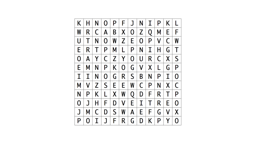
This is data: an undifferentiated mass of individual letters.

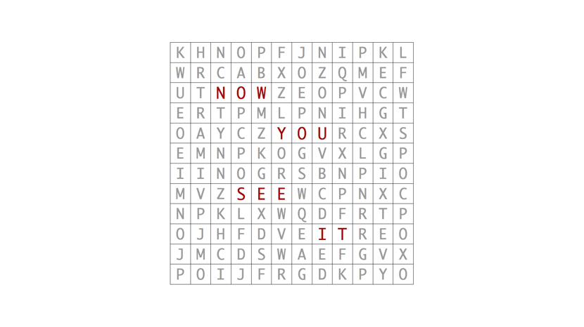
This is information: by organizing a meaningful arrangement of letters by color, a message emerges from the data.

This is knowledge: it's the same undifferentiated mass of individual letters as before, but you can still read the message because you know where to look; you’ve assimilated the information.

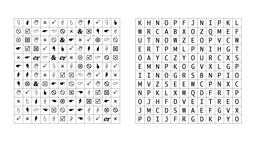
This is wisdom: because of your previous experience, you can make a pretty good guess which one of these grids is more likely to contain a message.

If you've confused these terms in the past, you can be forgiven. The imprecise use of these words is rampant. I looked up information in Wordnik, which shows the American Heritage Dictionary definition using the term knowledge to define information.
[bangs head on desk]
But you no longer have to be confused, gentle reader. Go forth and use your newfound knowledge wisely.
Term: Information radiator
So, here’s a term that’s new to me:
Alistair.Cockburn.us | Information radiator: "Coined around 2000 while standing in a Thoughtworks office looking at all the paper on the walls around me, ‘information radiator’ refers to a publicly posted display that shows people walking by what is going on. Information radiators are best when they are big, very easy to see (e.g. not online, generally), and change often enough to be worth revisiting."
(Via this GitHub project, which I found by following a link from ADN@berg, which was retweeted by ADN@dalton )
Information Architecture Defined
I ran across this definition of information architecture at IBM's developerWorks site and thought I'd share it here:
Design patterns for information architecture with DITA map domains
Information architectureInformation architecture can be summarized as the design discipline that organizes information and its navigation so an audience can acquire knowledge easily and efficiently. For instance, the information architecture of a Web site often provides a hierarchy of Web pages for drilling down from general to detailed information, different types of Web pages for different purposes such as news and documentation, and so on.
An information architecture is subliminal when it works well. The lack of information architecture is glaring when it works poorly. The user cannot find information or, even worse, cannot recognize or assimilate information when by chance it is encountered. You probably have experience with Web sites that are poorly organized or uneven in their approach, so that conventions learned in one part of the Web site have no application elsewhere. Extracting knowledge from such information resources is exhausting, and users quickly abandon the effort and seek the information elsewhere.
The same issues apply with equal force to other online information systems, such as help systems. The organization and navigation of the information has a dramatic impact on the user’s ability to acquire knowledge.